Sourse
Packaging Design: Pioneering a new format
Art Direction, Packaging Design, + Product Photography
-
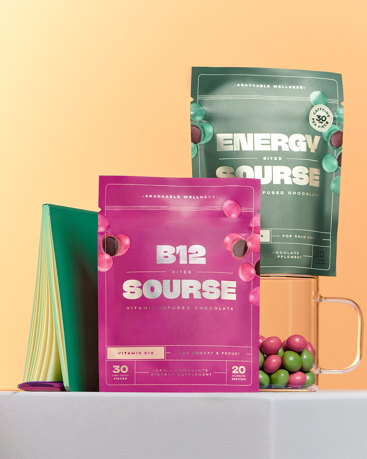
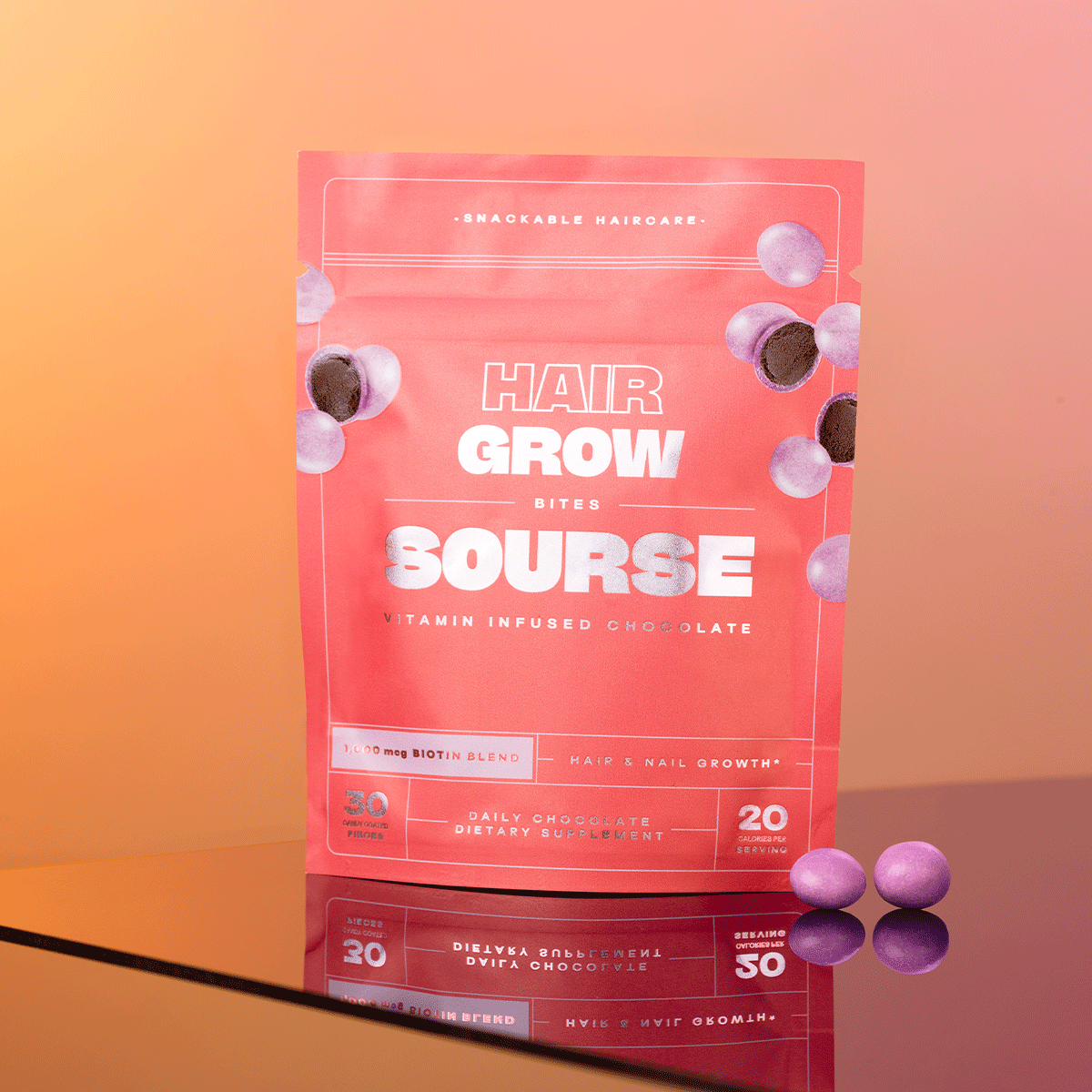
Sourse is a brand that transforms supplementing into an enjoyable ritual by infusing vitamins and nutrients into little chocolate candies. We have been told they are like guilt-free M&M’s. We emphasized the “snackable” nature of our products in our 10-count mini packaging and 30-count packaging designs by designing a snack pouch to hold our supplements People loved the fun and snackable nature of the pouches combined with sophisticated textures and visuals. We wanted to expand our packaging formats to include a 60-count format that would hold an entire month’s supply of Sourse Bites to encourage consistent and long-term use of our products and use fewer packaging materials.
-
Although our 10-count mini pouches and 30-count pouches emphasize the fun and tasty facets of our, we found that many people spoke about “eating the entire bag” because the chocolates tasted so good. While this was a good problem to have, we needed to figure out how to emphasize that the product is a treat, but one that is meant to be consumed daily following the clinically proven dosage guidelines.
-
After a lot of research, prototyping, and testing, we opted for a lightweight jar with a label that contained the same visual properties as our 10-count and 30-count pouches. We found a need to rely on more traditional supplement packaging to balance the snackable and fun nature of our product. By limiting the circumference of the jar we made it difficult for a customer to reach their entire hand in to snack on our products.
While this format change accomplished our goal of encouraging consistent and long-term daily use, It was a challenge to re-organize the packaging information in a smaller space and keep our packaging visual system consistent in a new format. We started by honing in on our core visual elements: line work, type styles, textures, and color. We worked with the same manufacturer as our pouches to produce our jar labels keeping consistency in color and materials, and textures. However, we could not fit all of our pertinent product information on the jar label alone. So, we produced a display box to hold the 60-count jars in a retail environment to create additional space for the product details on our pouches and product display pages.
One of the goals of this project was to minimize packaging materials to reinforce our commitment to best-in-class sustainability practices. We met this goal with a two-pronged approach. Firstly we used 100% post-consumer recycled materials. Second, we designed a 60-count refill pouch for our subscription customers that uses 37% fewer materials for a month’s supply of Sourse chocolate bites. We extended our jars and refill pouches to Sephora to offer to their online subscribers as well.
Partnering with the iconic fashion photographer, Nico Kern, we updated all of our imagery to visually align with the lifestyle studio imagery we created for our launch at Sephora in 2023. We leaned on Nico’s photographic style to create images that are beautiful, yet realistic. Our shoot focused on showcasing our elevated designs while conveying the true texture our our packaging. We did this to establish customer trust through honest images that would more closely align with what people would receive in their subscription orders. Introducing a new product to the market creates a lot of scrutiny in a customer. We wanted these images to be beautiful while reflecting the natural imperfections that happen in the flexible 10-count and 30-count pouches.


