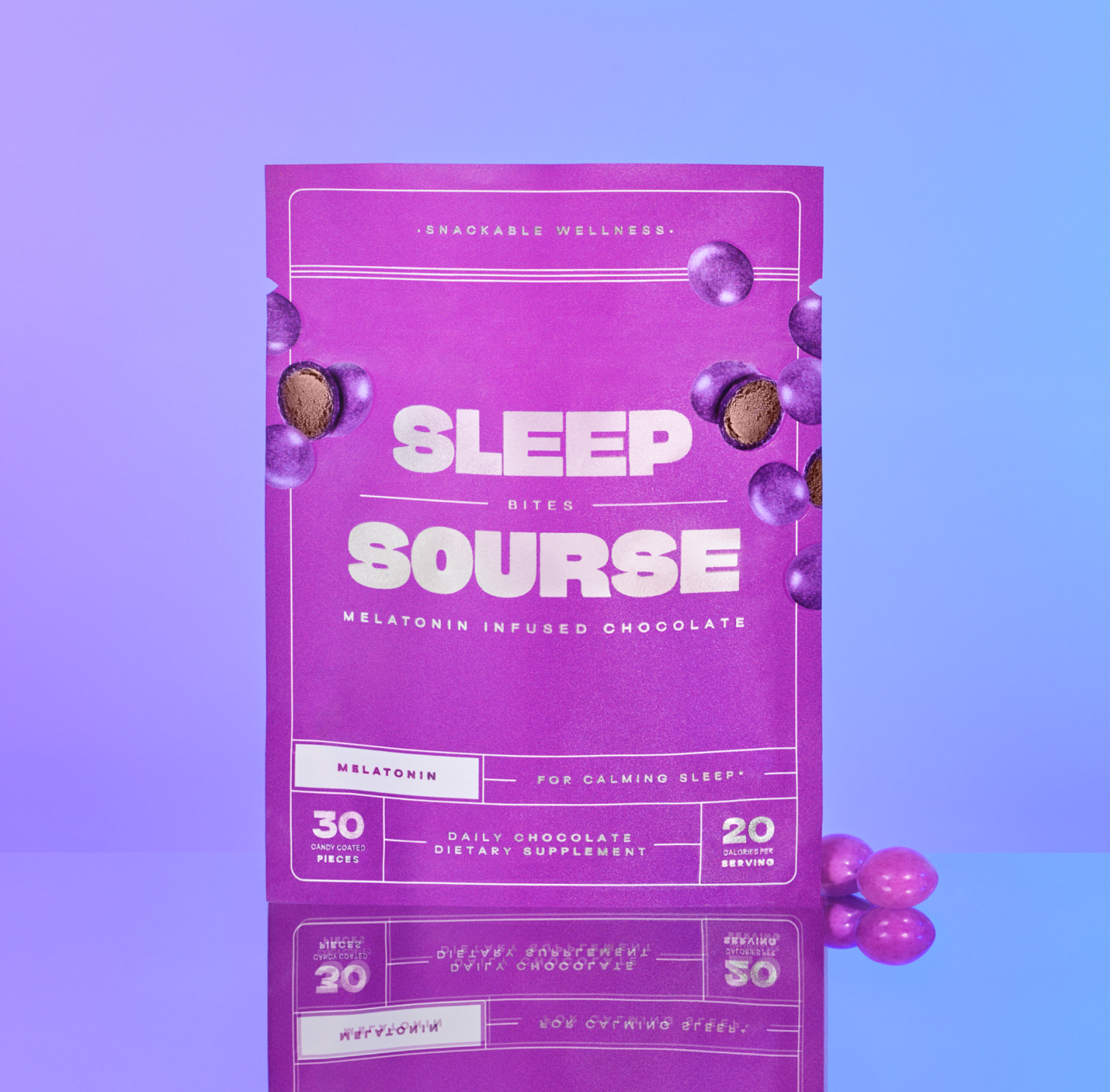
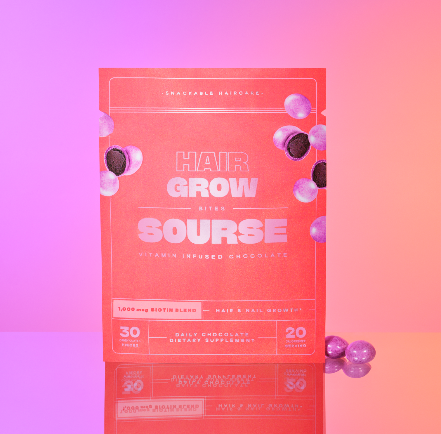
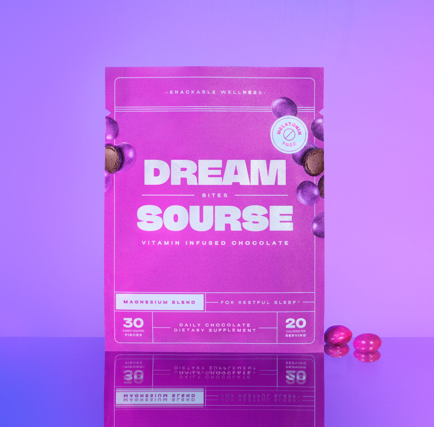
Sourse
Packaging Redesign
Art Direction, Packaging Design, + Product Photography
-
Sourse needed to improve its packaging design and naming conventions to appeal to the Sephora customer base.
-
The original packaging design was designed for an online, direct-to-consumer business. In this model, there is typically other information surrounding product imagery to support and explain a given product. Whether it is a caption, a landing page, or a product detail page—one does not need to rely solely on the packaging design to convey what the product is and why it is worth buying.
We outlined two key problems that needed to be addressed in this redesign to transition our digitally native products to converting sales in a traditional retail setting:
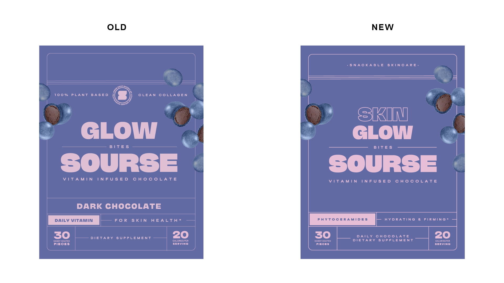
The packaging design needed to optimize the top 2/3 of the package. The Sephora retail shelves covered the bottom third of our packaging, and we had to ensure that key items like product names and the Sourse logo would not be obscured.
The information hierarchy needed to be both enticing and quickly legible while conveying what the product is.
-
In assessing this redesign we decided to keep the original packaging format and branding. Through customer and advisor feedback we learned this packaging format enhanced the fun and snack-like nature of the product. We also kept our packaging materials consistent as the foil layer in our pouches created eye-catching accents on a retail shelf. The juxtaposition of the matte finish over the shiny foil created an elevated feel with simple materials.
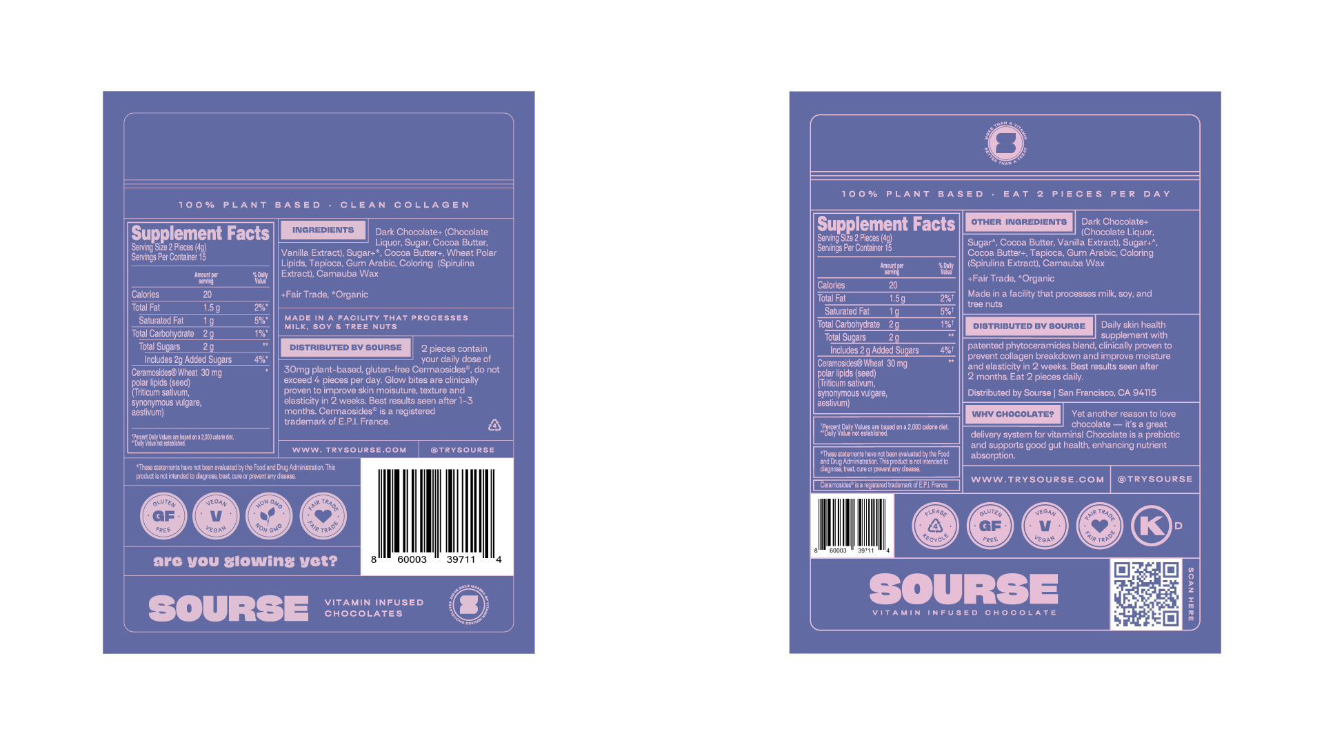
Next, we established our information hierarchy and reworked our naming convention to include what each product targets. For example "Glow Bites" became "Skin Glow Bites" and "Beauty Bites" became "Hair Grow Bites." We added an ingredient callout and a specific value proposition to explain what the product does. Lastly, we coined the phrase "Daily Chocolate" to encourage consistent use along with “Snackable Wellness" to convey the fun and effective nature of the product.
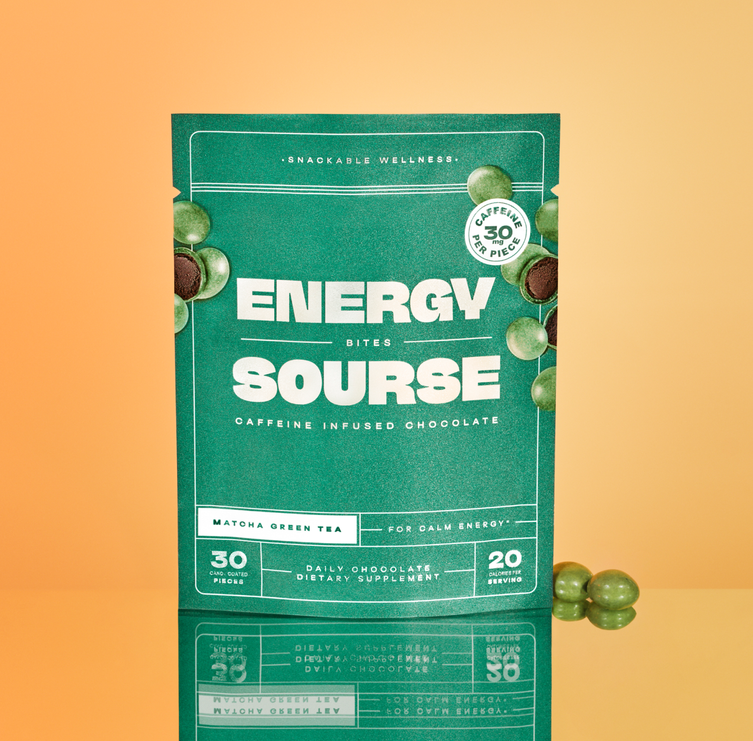
These changes were made initially for Sephora, but with the overwhelmingly positive feedback from other retailers, we applied these changes across all of our 30-count packaging SKUs and expanded the design concept into a mini 10-count pouch for Whole Foods Market to carry at checkout.
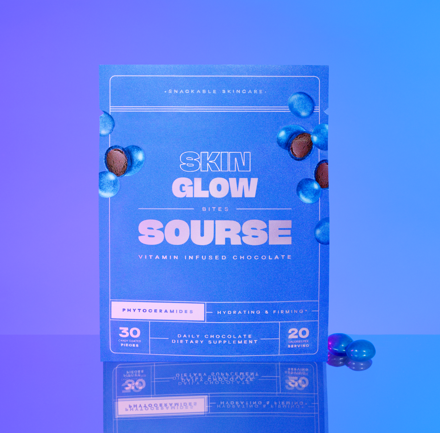
The packaging redesign posed a need for new product photography. To ensure consistency, we collaborated with Heidi’s Bridge, the studio responsible for our initial product photography. We maintained continuity by using the same setup while introducing new background color gradients to align with the refreshed packaging designs. By slightly adjusting the lighting, we achieved an airy, glamorous, and dreamy aesthetic for the updated product shots.
We also developed still-life compositions featuring products for select products. These images highlighted the fun and approachable nature of incorporating the products into a daily routine. Demonstrating how Sourse envisions its chocolatey vitamin treats as a ritual that customers look forward to and reinforcing the brand’s core value that wellness should feel like a treat for both you and your body.
