Karenina
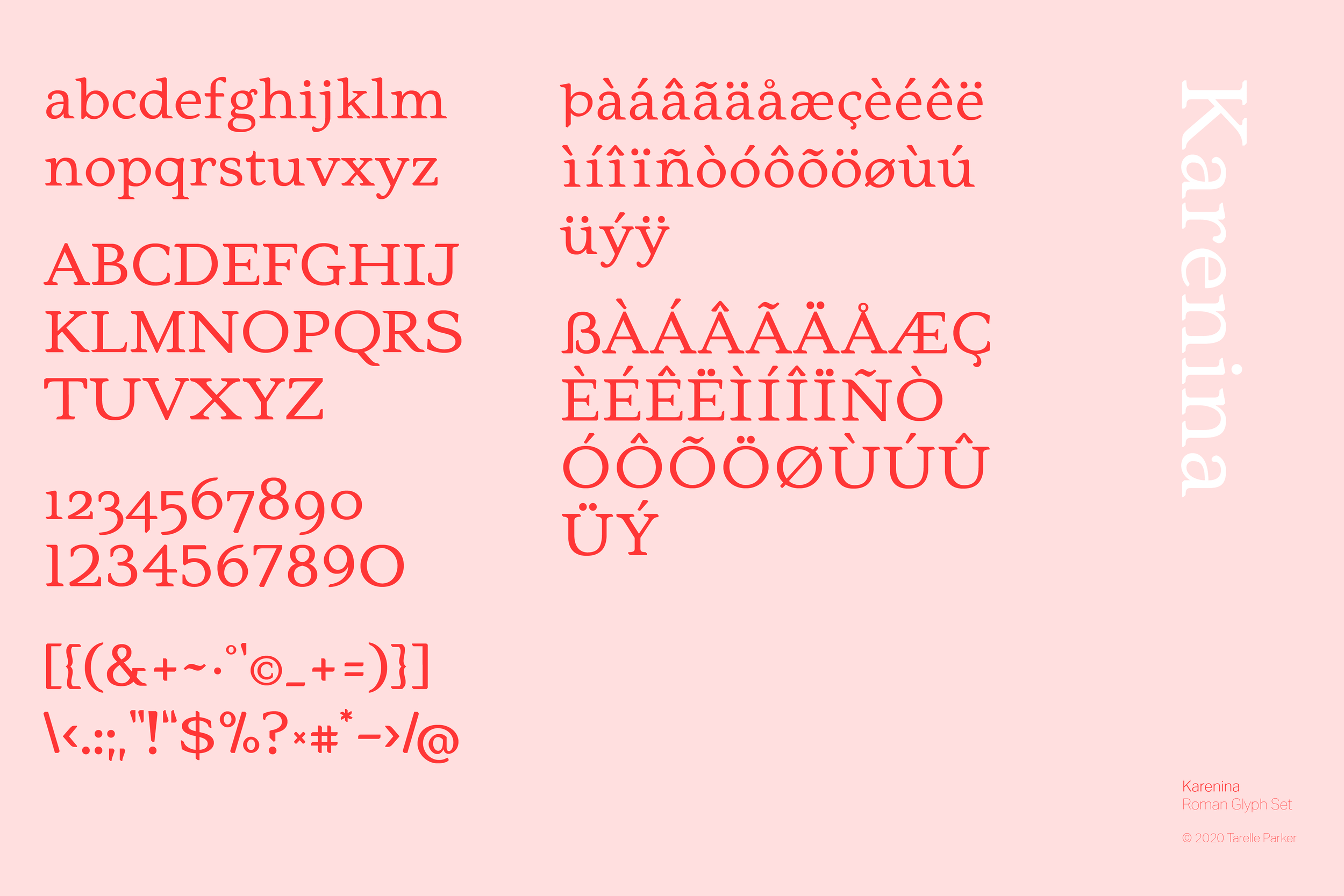
Text face Roman Glyph Set
-
Whenever I start a project, having a central idea is key. When working with a team, or a client my first action is for us to generate a word list, a list of three to five highly distilled words which embody the idea of a given project. A typeface design is an excellent example of using a word list, or in this case, a character from a book, to streamline the idea into a functional form.
-
I love designing typefaces. The parameters are set. There are twenty-six characters to convey the core of an idea. Then there is the punctuation and the caps where the designer can imbed little surprises for the user. If one has the gift of time, they will get to play around with special characters for the geekiest of type geeks, like myself, to discover.
The problem here is no problem at all: I wanted to do something fun. -
Sharp.
Feminine.
Functional.
Nuanced.
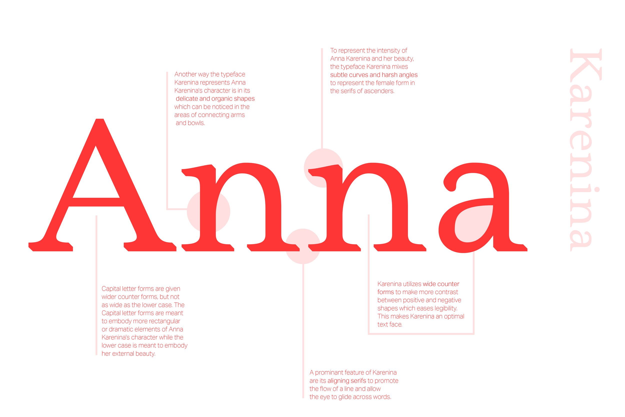
I based this typeface off Leo Tolstoy’s character Anna Karenina, from the epic novel, Anna Karenina. Anna is a beautiful woman who has many flaws. Her beauty is a poison which breaks her facade and unearths treacherous elements of her character. This text face balances organic shapes with harsh angles in the same way Anna’s character balances outward beauty with inner turmoil.
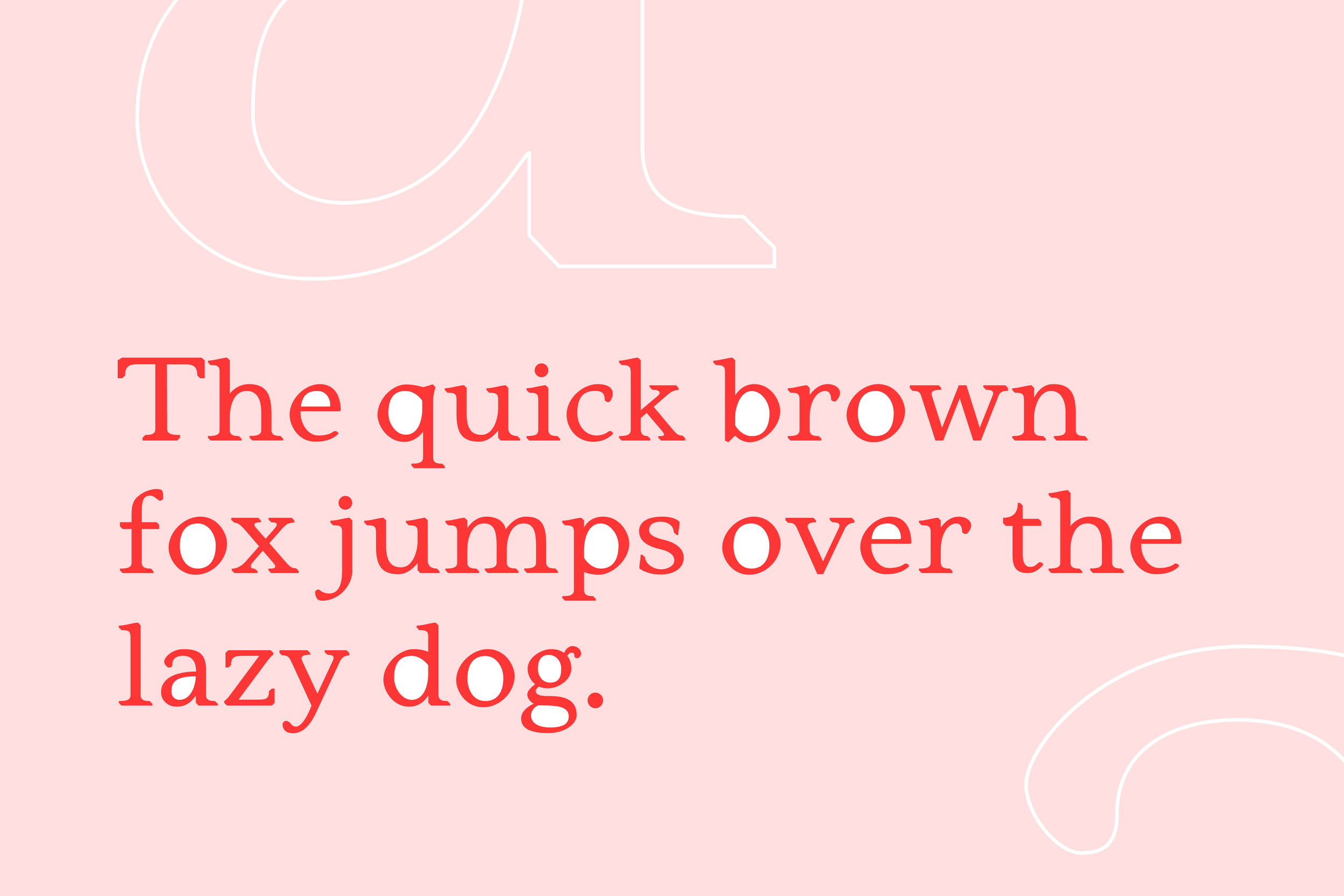
This text face is designed to be easy to read and suitable for and epic novel, like Anna Karenina. The wide apertures, balanced contrast, and rhythmic kerning are elements that make this text face easy to read for long periods of time.


