Sourse
Packaging Redesign
-
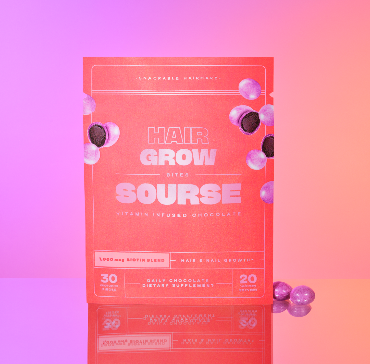
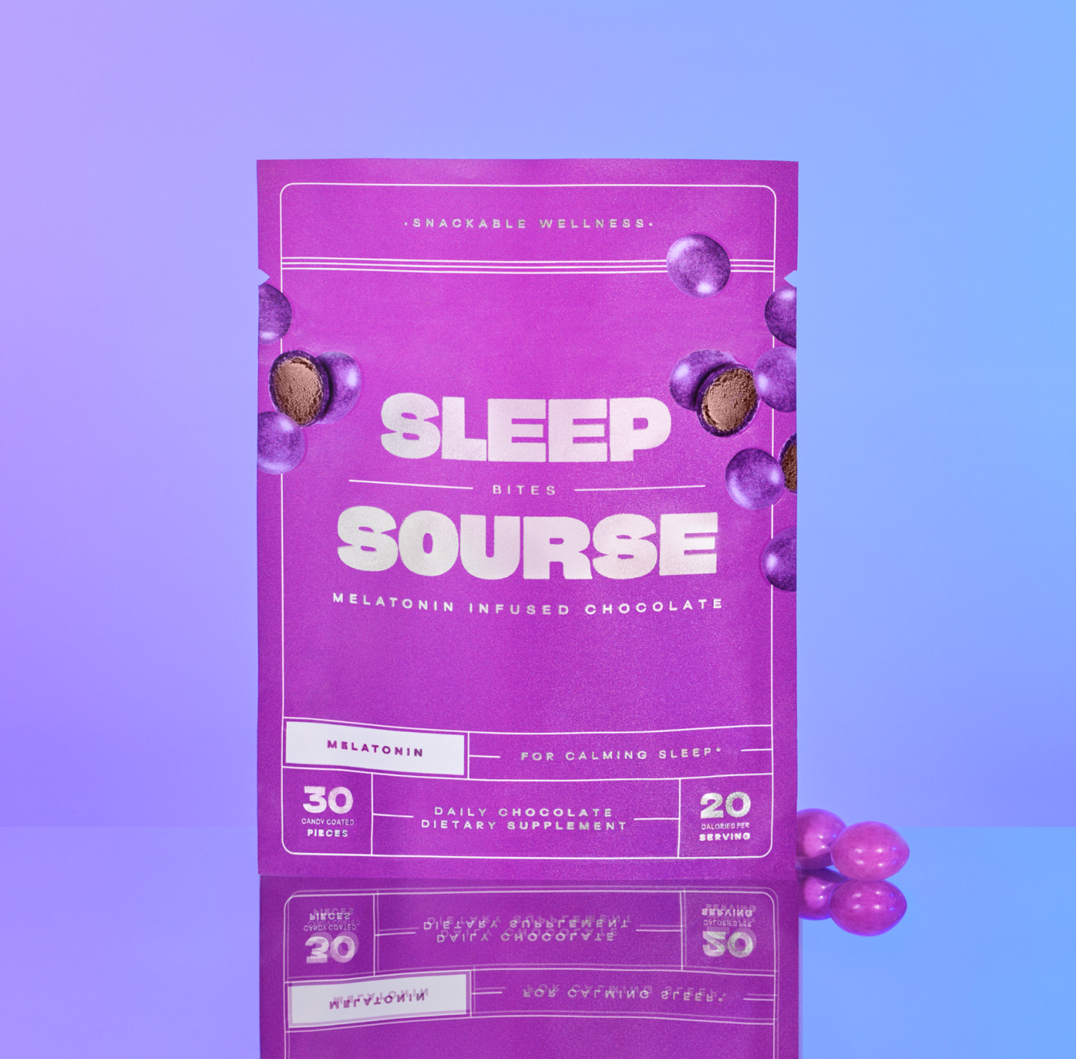
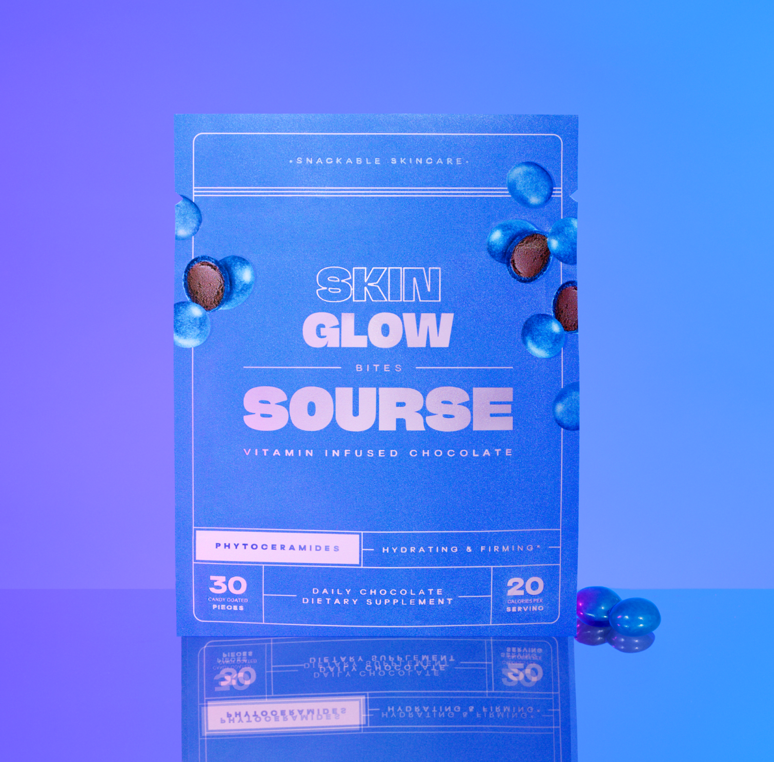
Sourse needed to improve its packaging design and naming conventions to appeal to the Sephora customer base.
-
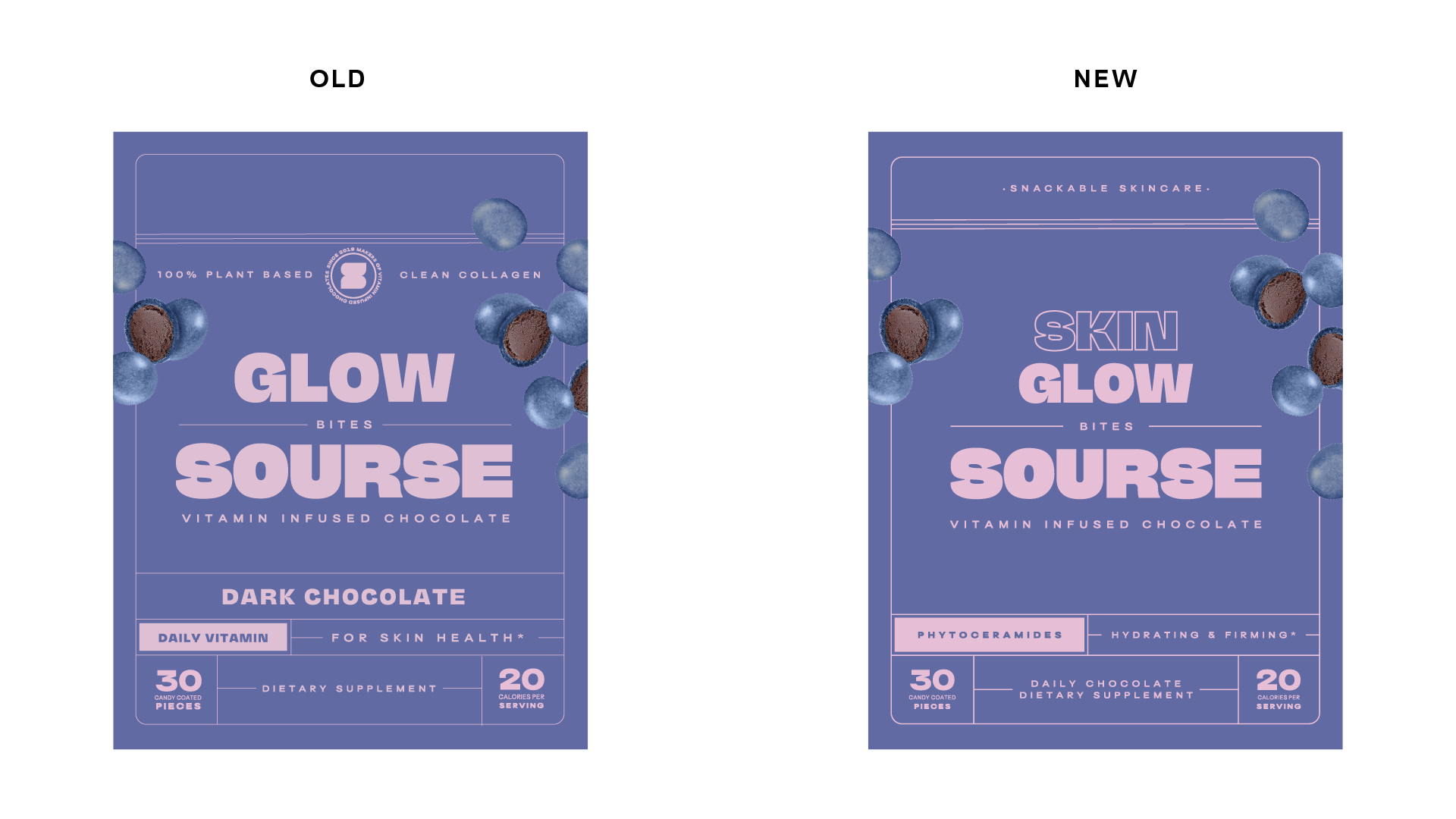
Sourse packaging was initially designed for a digitally native customer. The information on a product display page or landing page bolsters a product, and there is not a need for quickly legible and informative packaging design. We had three challenges facing us:
The packaging needs to optimize the top 2/3 of the design, becaue the bottom 1/3 is covered by shelving at Sephora.
The information hierarchy needs to be quickly legible.
The customer needs to understand what the product is immediately.
-
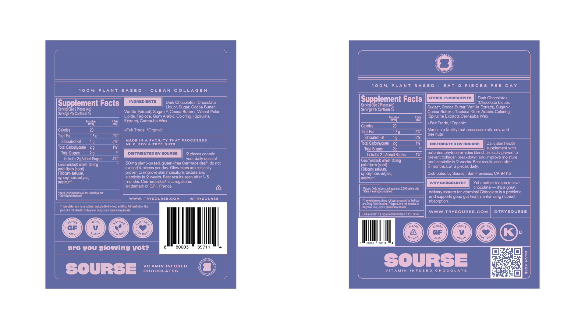
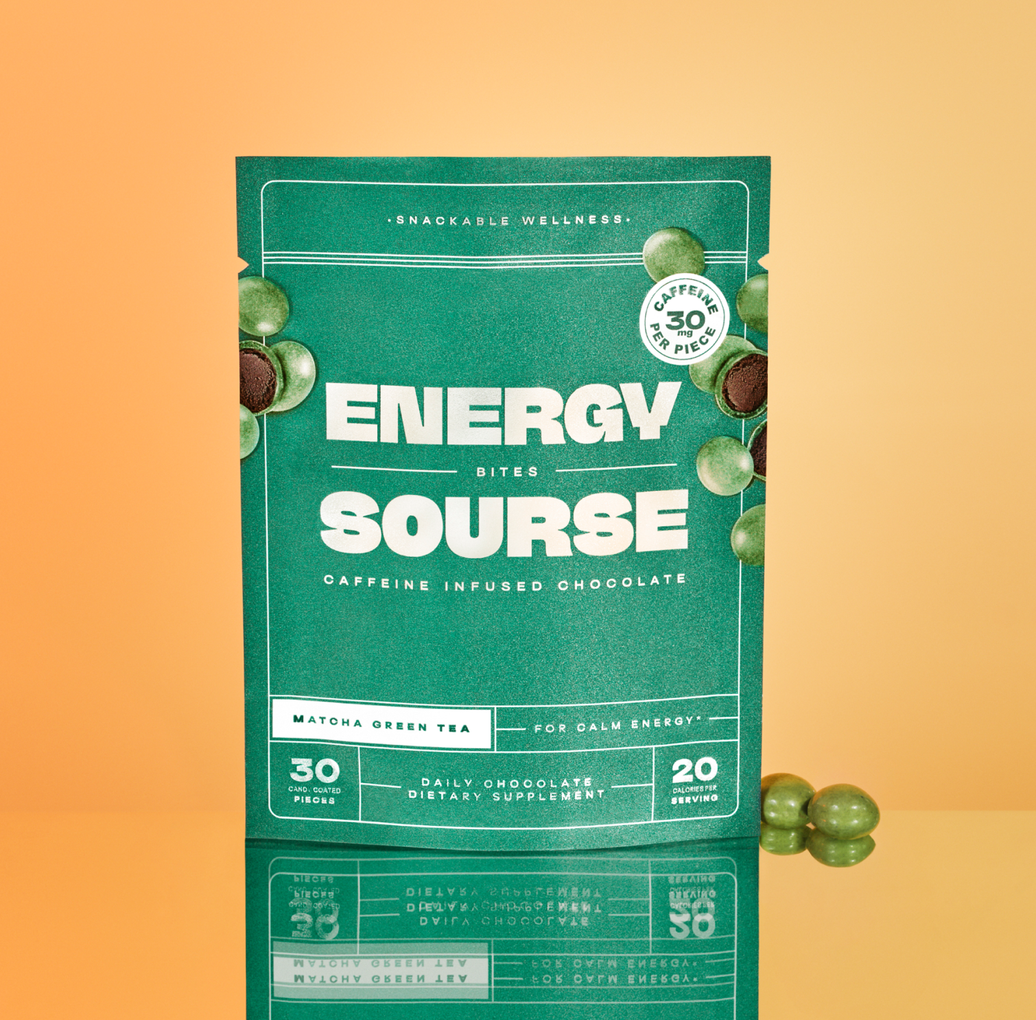
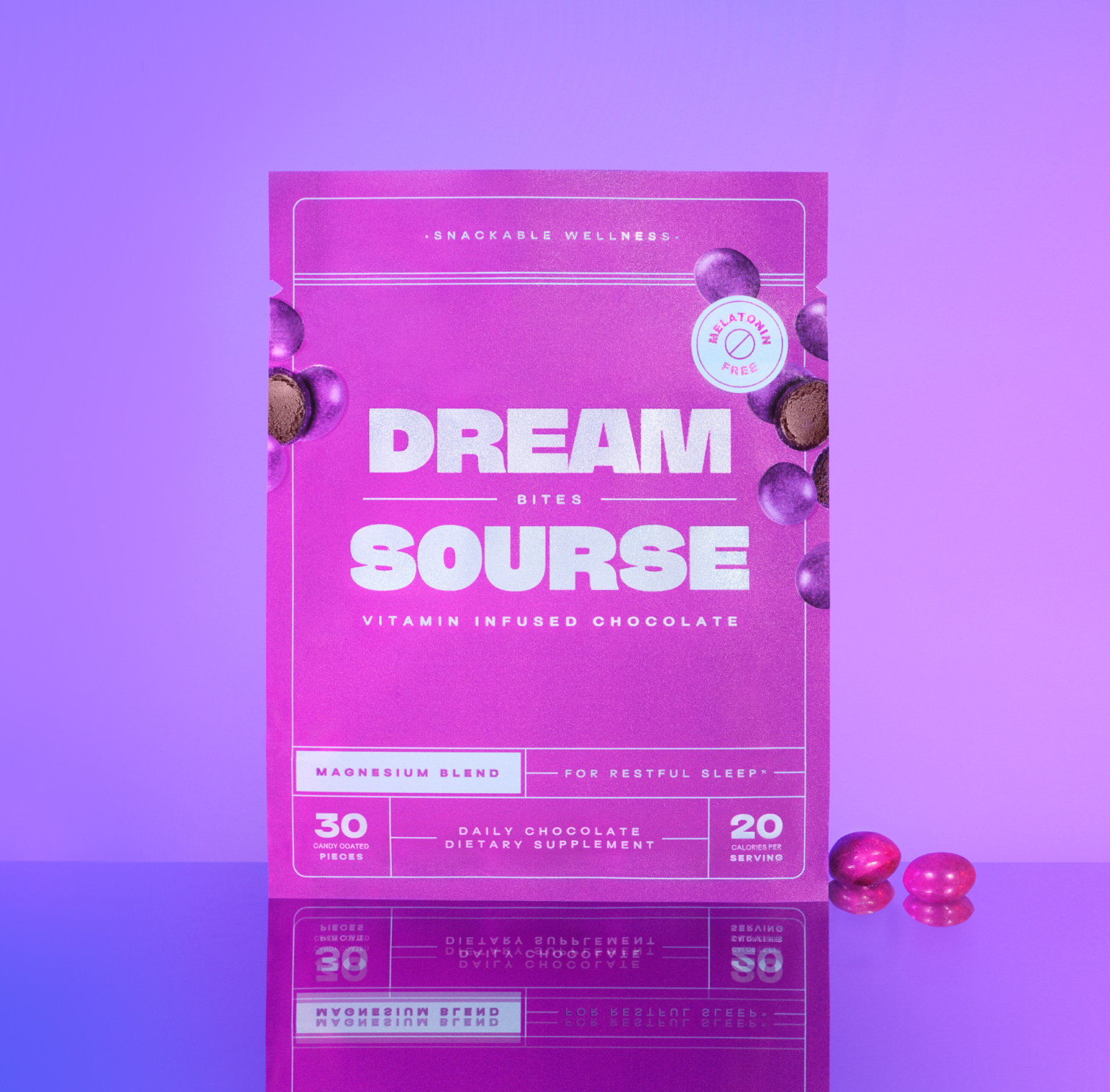
We began with changing our naming convention to include what the product is targeting. For example "Glow Bites" became "Skin Glow Bites" and "Beauty Bites" became "Hair Grow Bites." After determining this change, we assessed that we wanted to keep the branding intact, but make the packaging more streamlined. To do this we added and ingredient callout, and a specific value proposition for the customer. We included a mention of "Daily Chocolate" to encourage consistent use and coined the term "Snackable Wellness" to convey the fun and effective nature of the product.
These changes were made initially for Sephora, but with the overwhelmingly positive feedback from other retailers, like Whole Foods Market, we applied these changes across all 30-Count packaging SKUs.
